

Kawaii Monster Cafe App Design
This is an updated prototype of an app that is made for a restaurant located in Tokio, Japan, by the name Kawaii Monster Cafe. This particular location was one of my most favorite and memorable experiences, that I got the chance to visit and be part of, couple of summers ago, which inspired me to design a new branding system and visuals to match their playful aesthetic.
This whole project was intended to be created for an already existing company that does not have an app yet. Since this particular restaurant only had a very creative website, I decided to not only design an app for them, but also create a new branding as well.
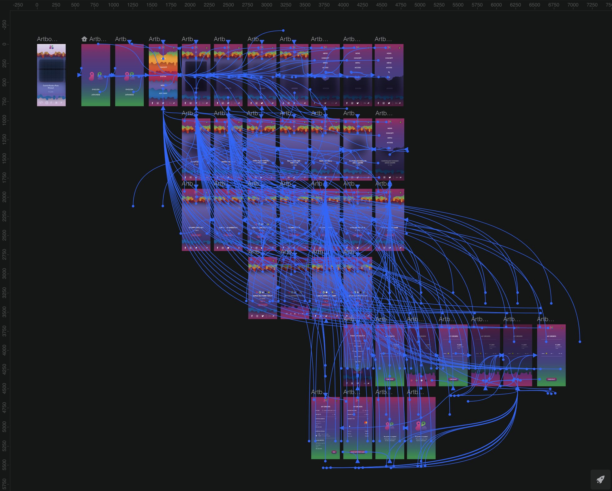
I created this prototype with the help of Invision Studio and focused on creating a minimalist design, as well as integrating animated elements to enhance the dynamism of the overall project. As I was researching about the company and website, I was inspired by their food theme and color palette, that they have displayed in the official website of the Kawaii Monster Cafe. I have also worked on this prototype a year prior to this app, and I decided to update the design, as I improved my design skills. The old version was a transformation of their current website design into an app. Later on, I decided to improve the overall design, by integrating my own designed branding system, color palette and illustrations.
For the colors of the prototype, I mainly was influenced by the amazingly saturated and crafted meals that they offer in the restaurant. Additionally, for the logo, as I was analyzing their original logo, and I noticed the integration of a monster and letter K+M in one logo. Therefore, I decided to create something similar, that still suggests a silhouette of a playful monster and the letters K+M in a more minimalistic way, to match with the aesthetic of the overall project.
New Screens
Logos
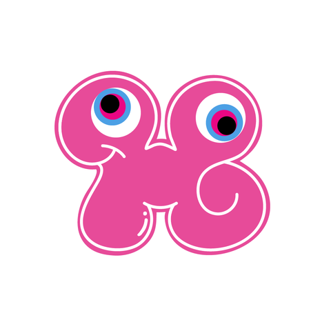
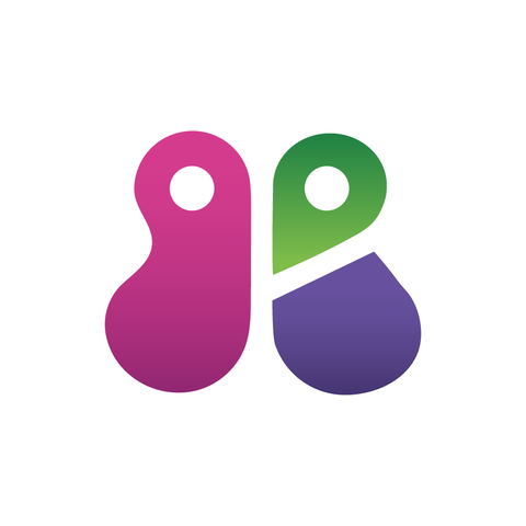
As the original illustration of the official company logo is very detailed, I wanted to simplify it and help the logo be utilized in more mediums/materials. I still wanted to keep the bulky shape of the logo in order to resemble both K and M letters in one image. This also allowed the logo to preserve the monster character look, as well.
Company's Original Website
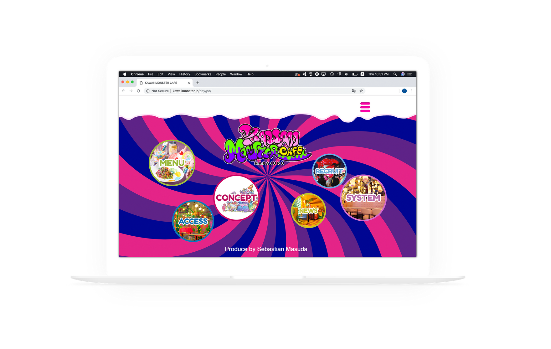
My Initial Old Wireframes Made in 2017
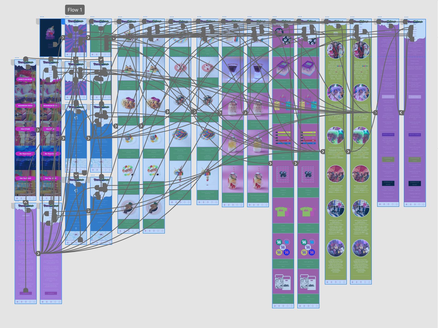
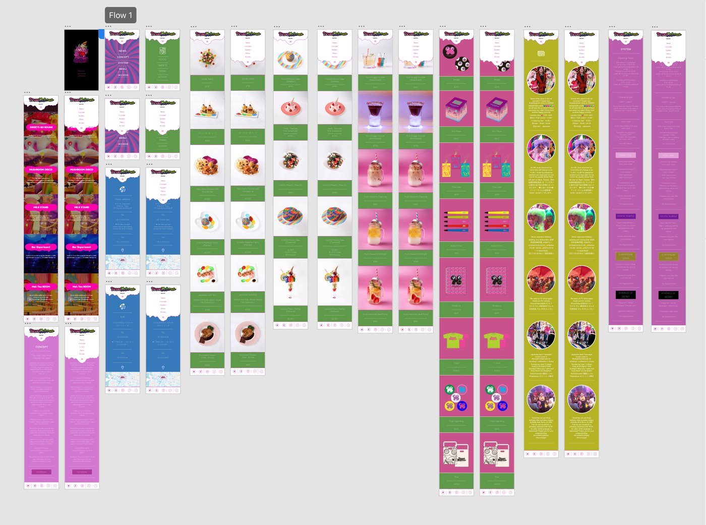
My Proposed Logos for the App During in 2017
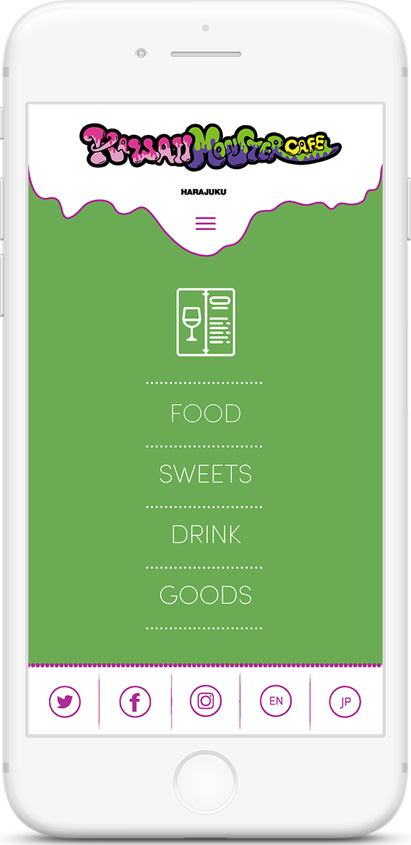
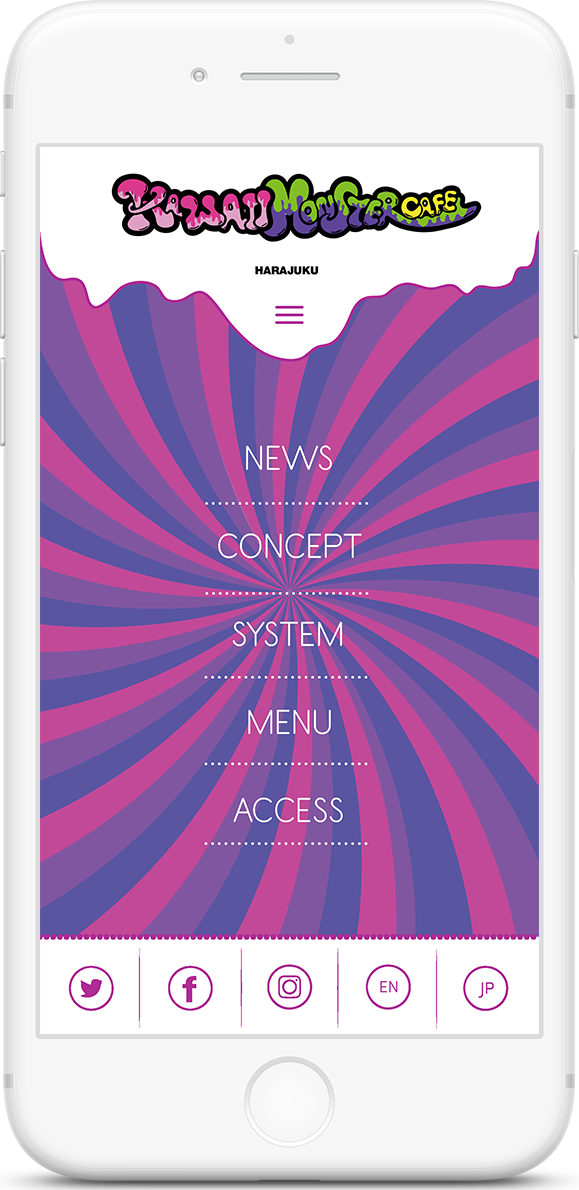
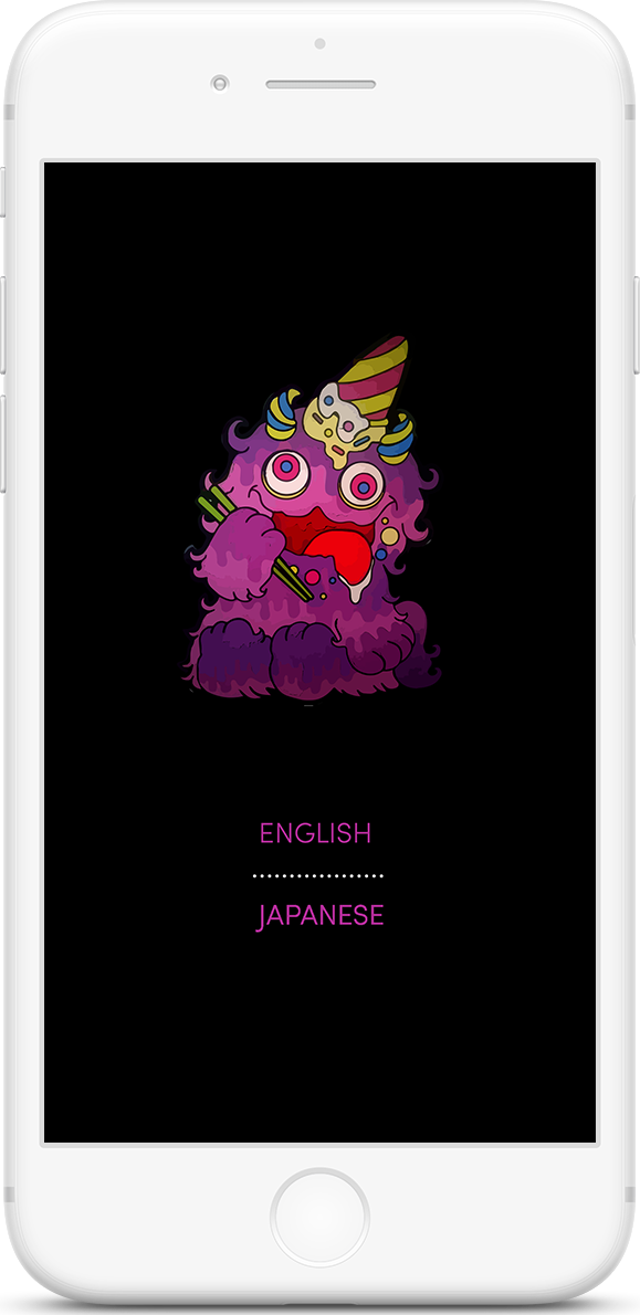
Full Video of the Old Prototype
Wireframes of the Final Version During 2019