

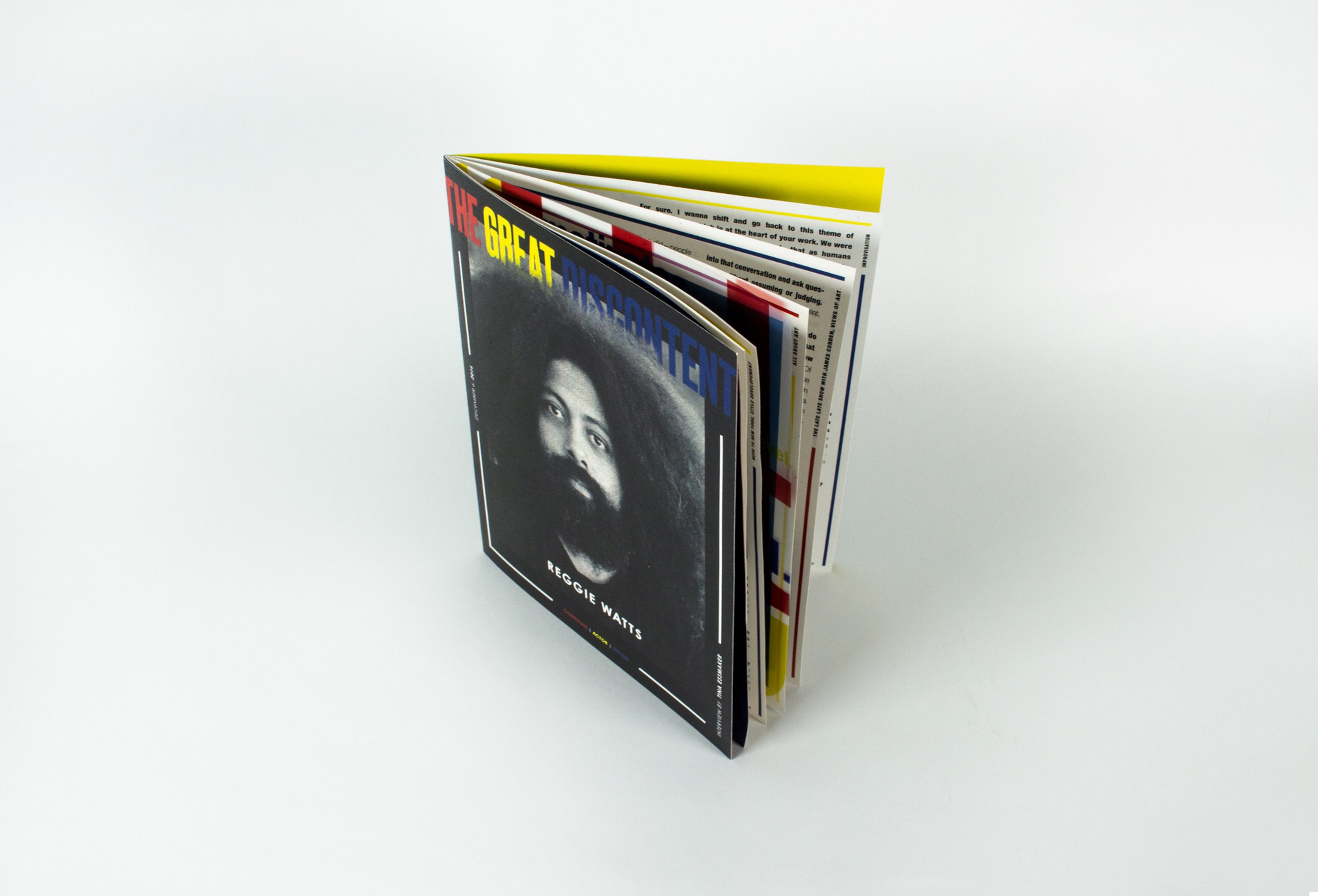
The closed magazine standing on a white surface, its fanned edges showing red, yellow and blue sections, a black-and-white portrait of Reggie Watts on the cover
The contents spread: a flat red left-hand page facing a blue page with the section numbers 01 to 04 listed in yellow and white
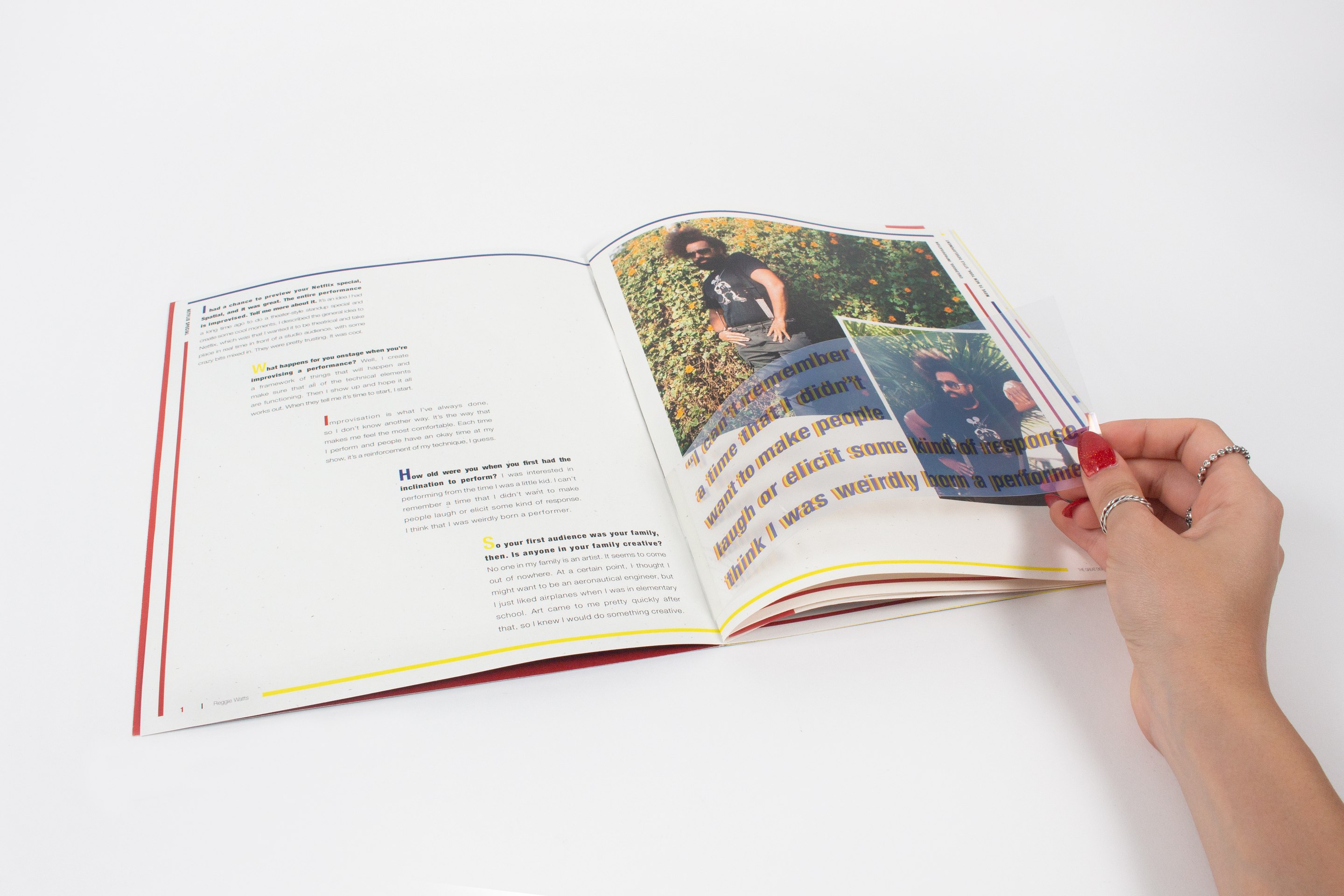
A detail of the opening spread, an oversized pull quote in yellow outlined type running across a photograph of Watts outdoors
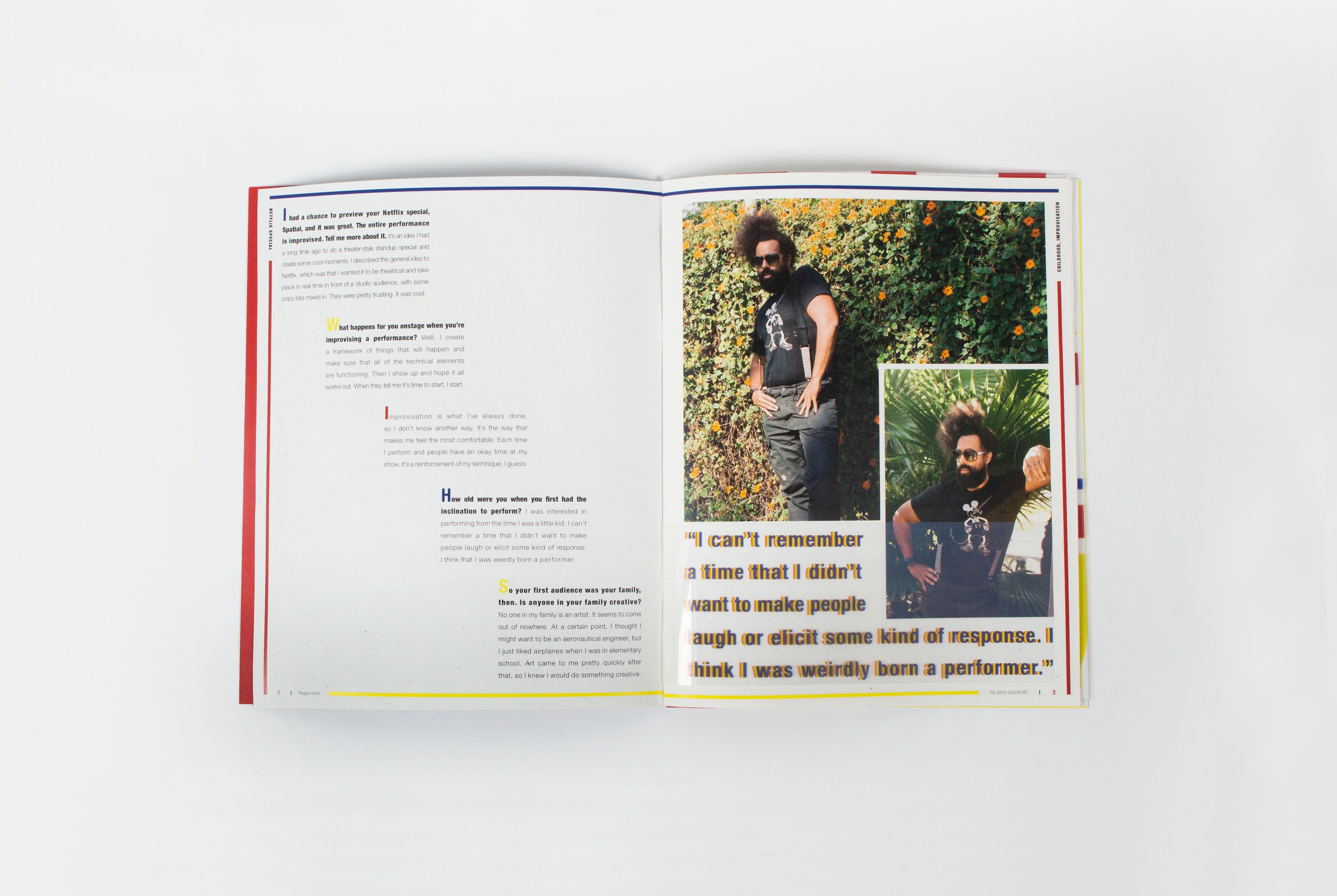
The same spread flat: a column of interview text on the left, three stacked photographs of Watts on the right beside the quote
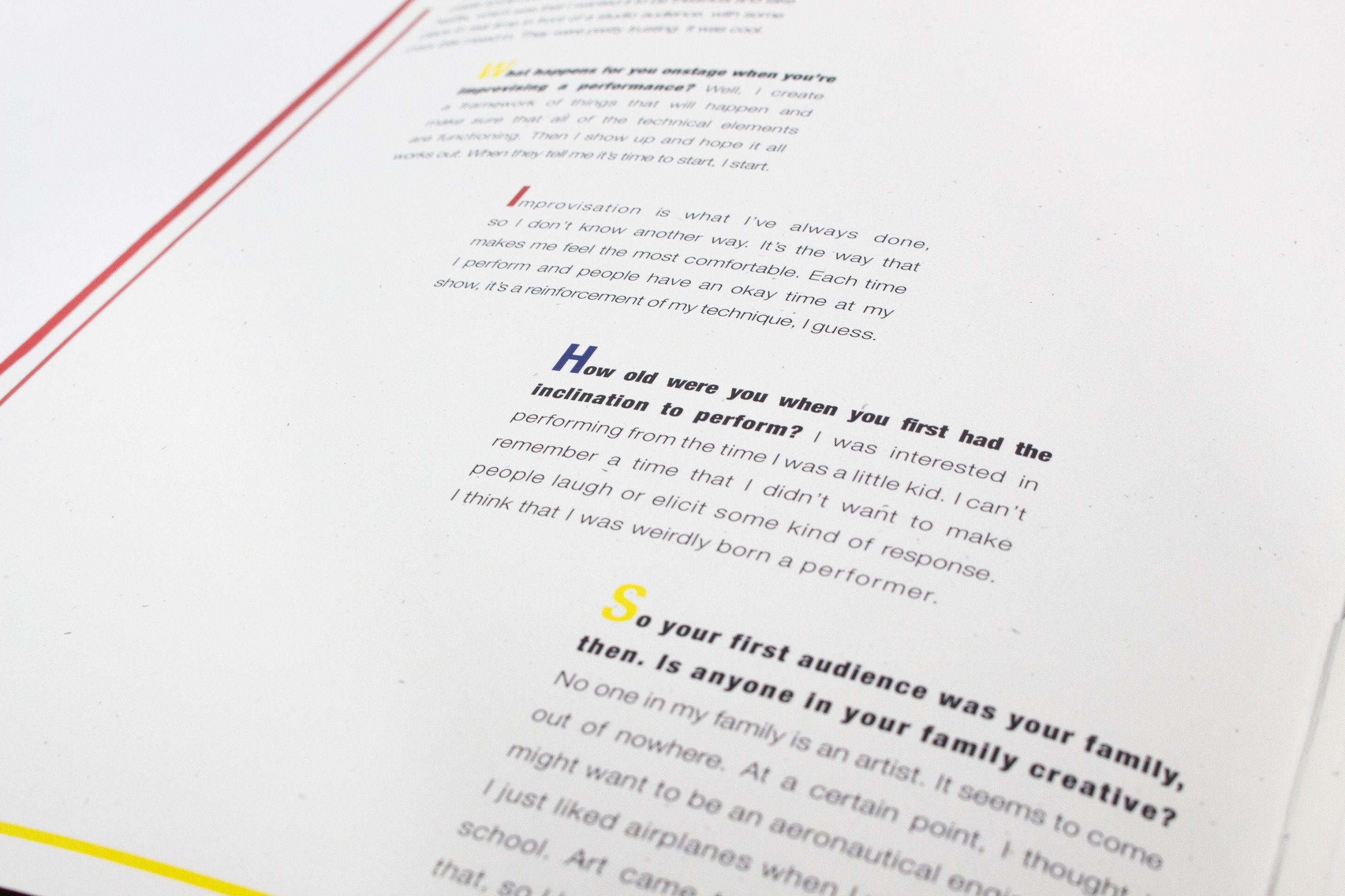
A raking view of a text spread, the questions set in blue and red italic against grey answer columns
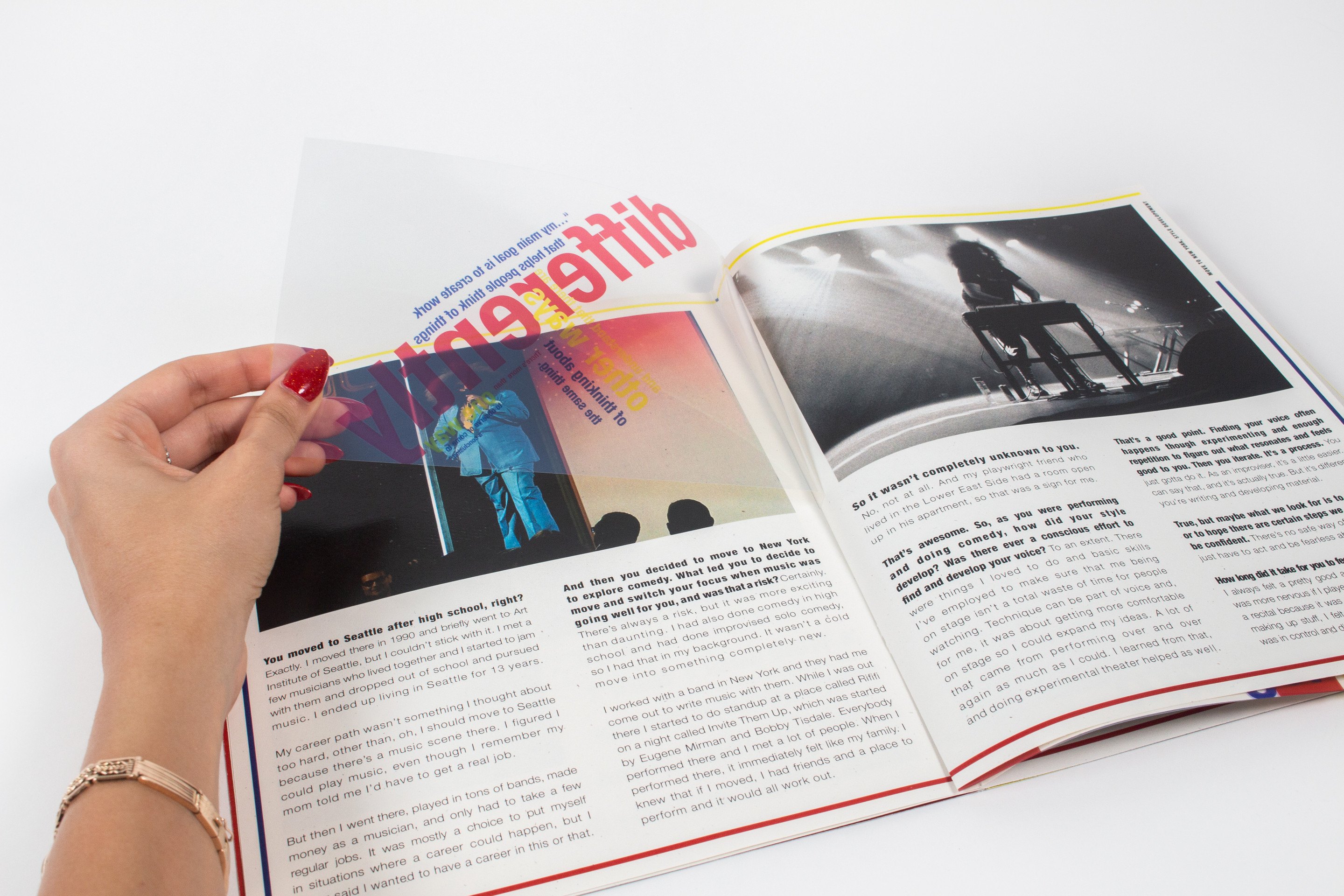
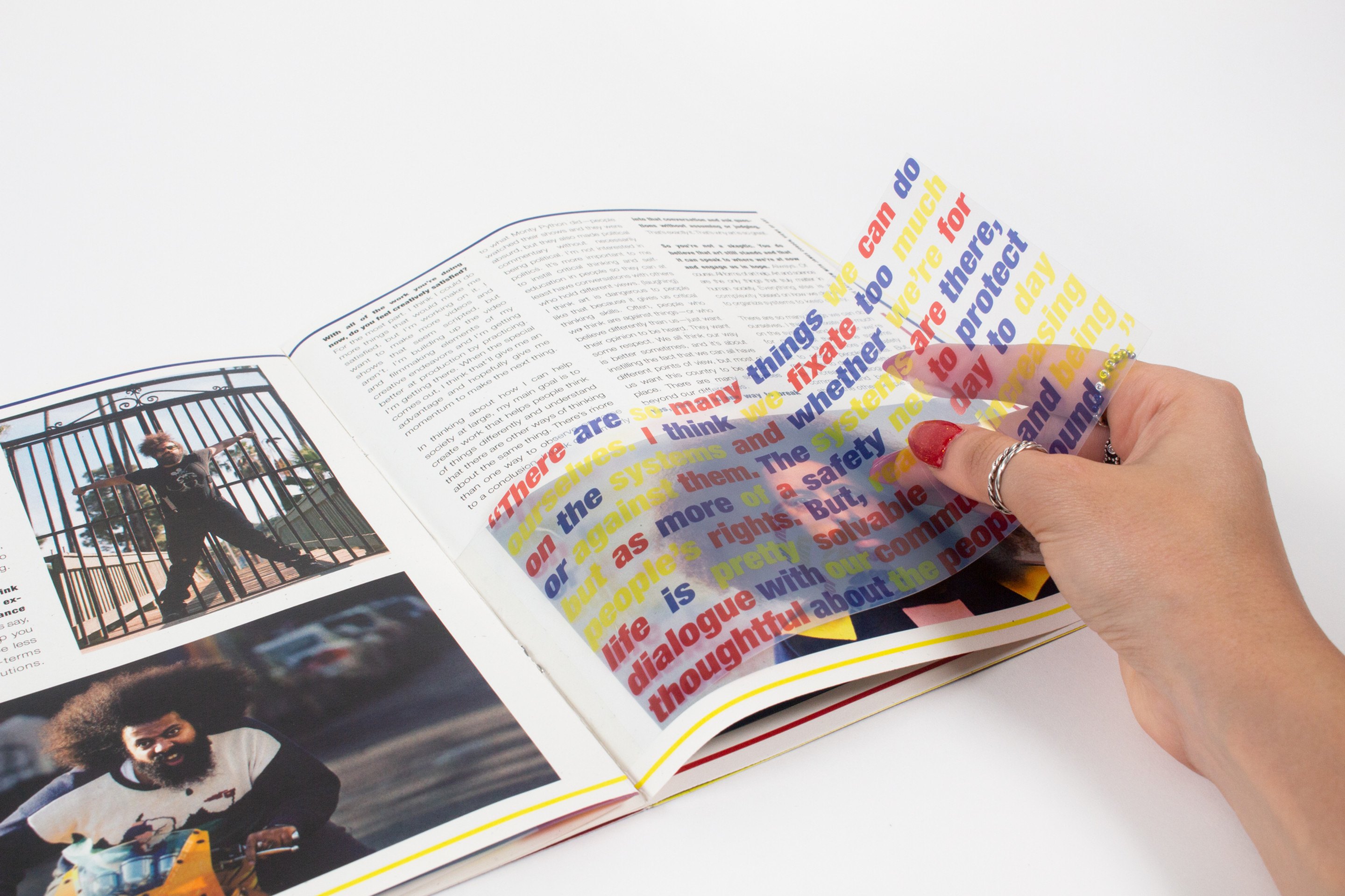
Hands lifting a printed transparent sheet away from a spread, the word “differently” in red and blue coming off the page beneath
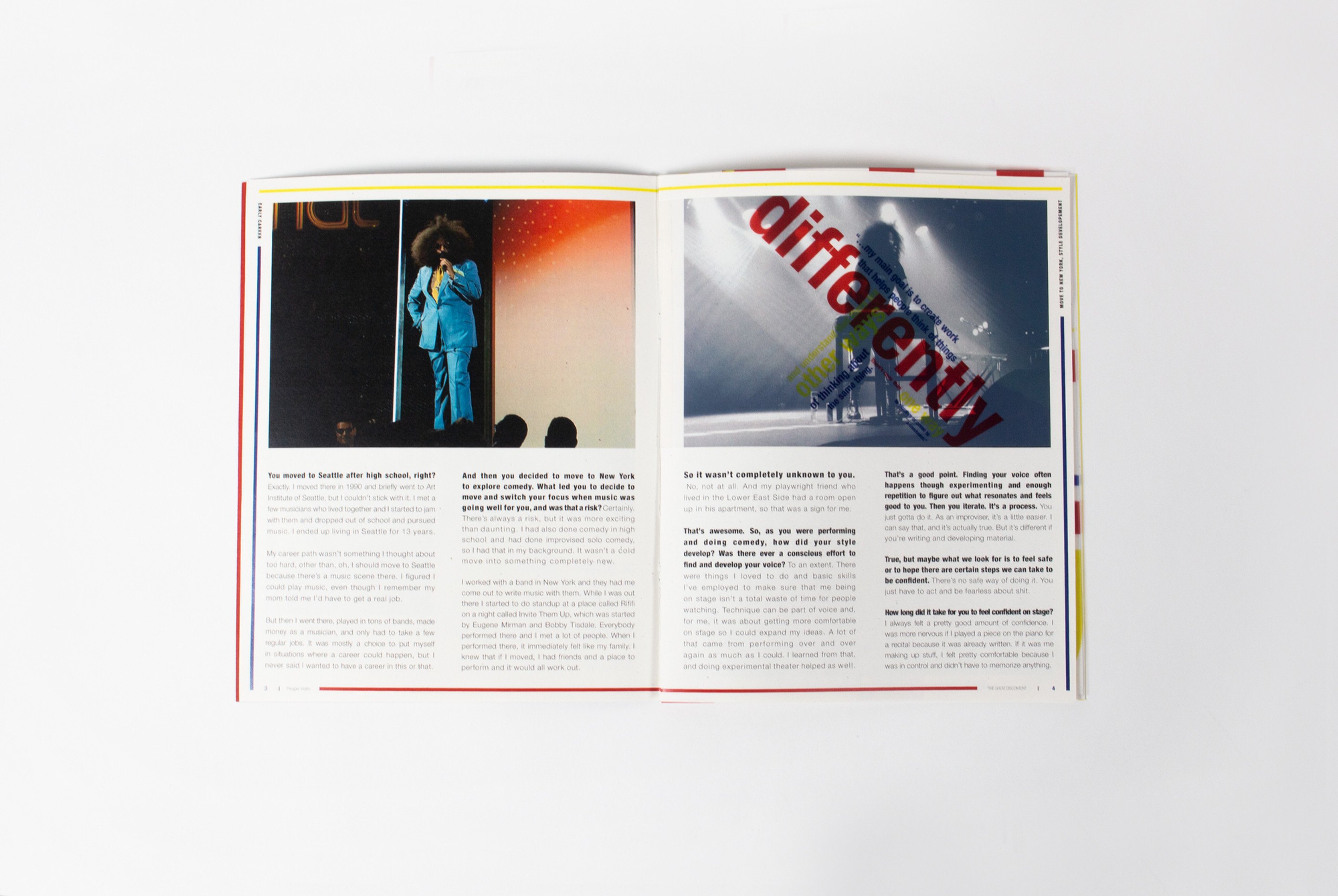
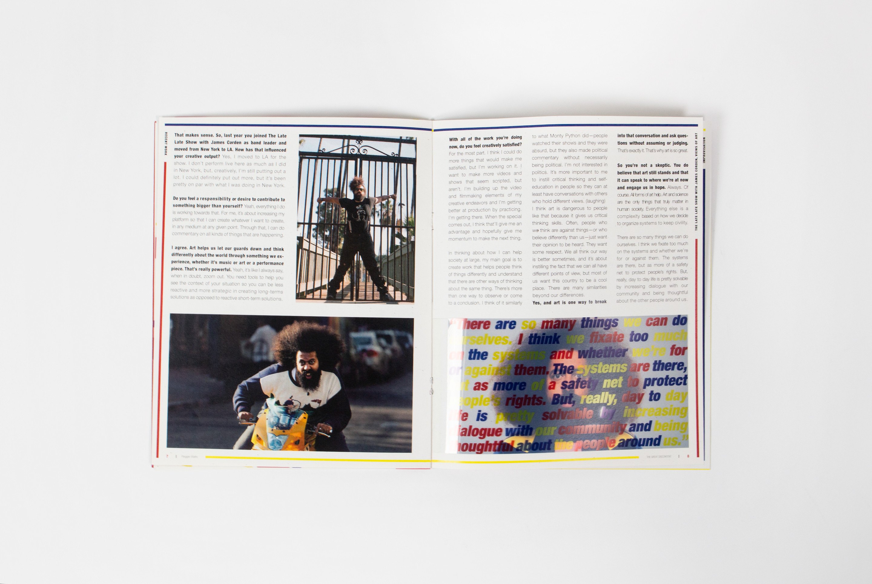
A spread with two stage photographs of Watts performing, the transparent overlay laid flat so its type sits over both images
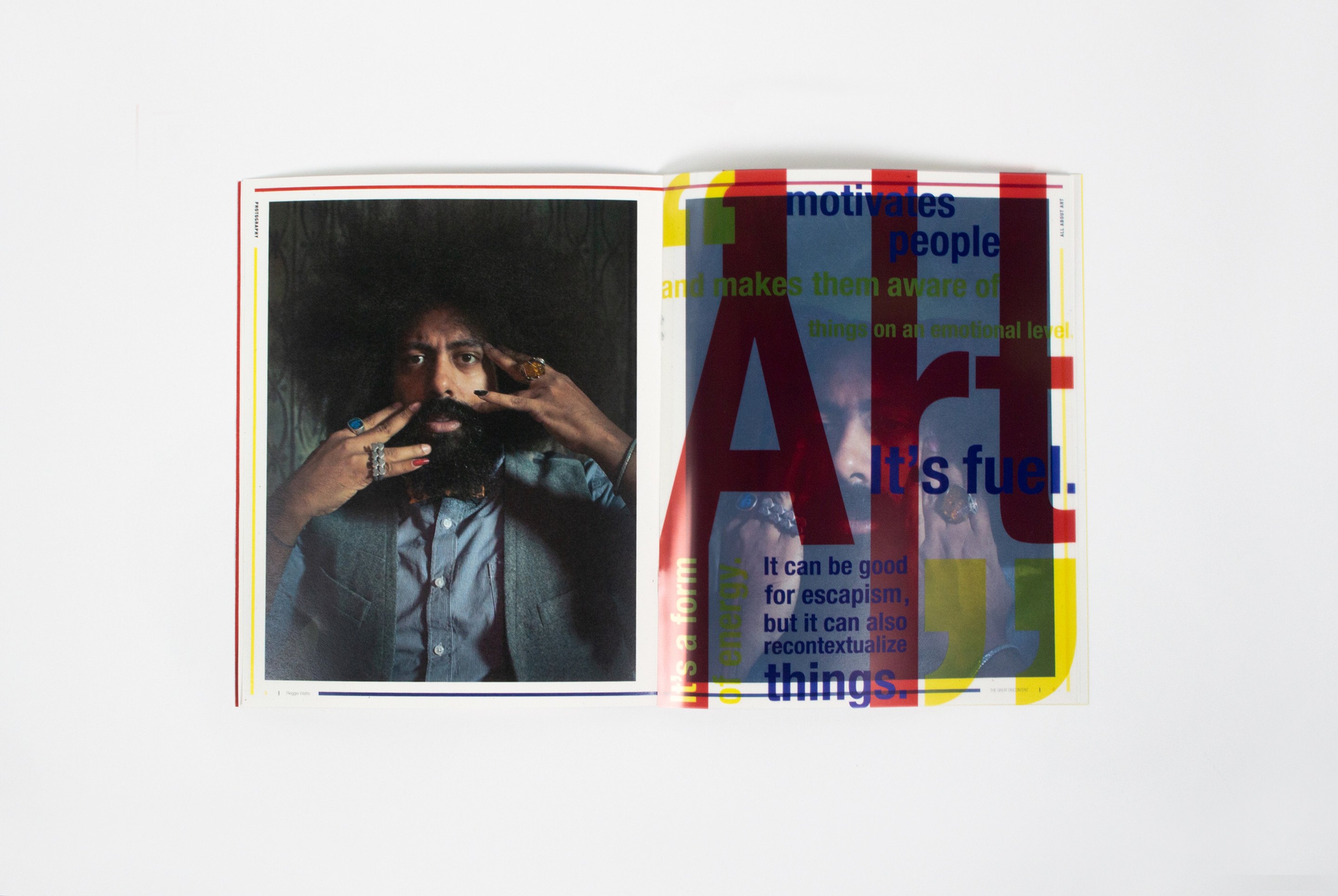
A spread with the word “Art” set very large in red over a photograph of Watts holding a camera to his face
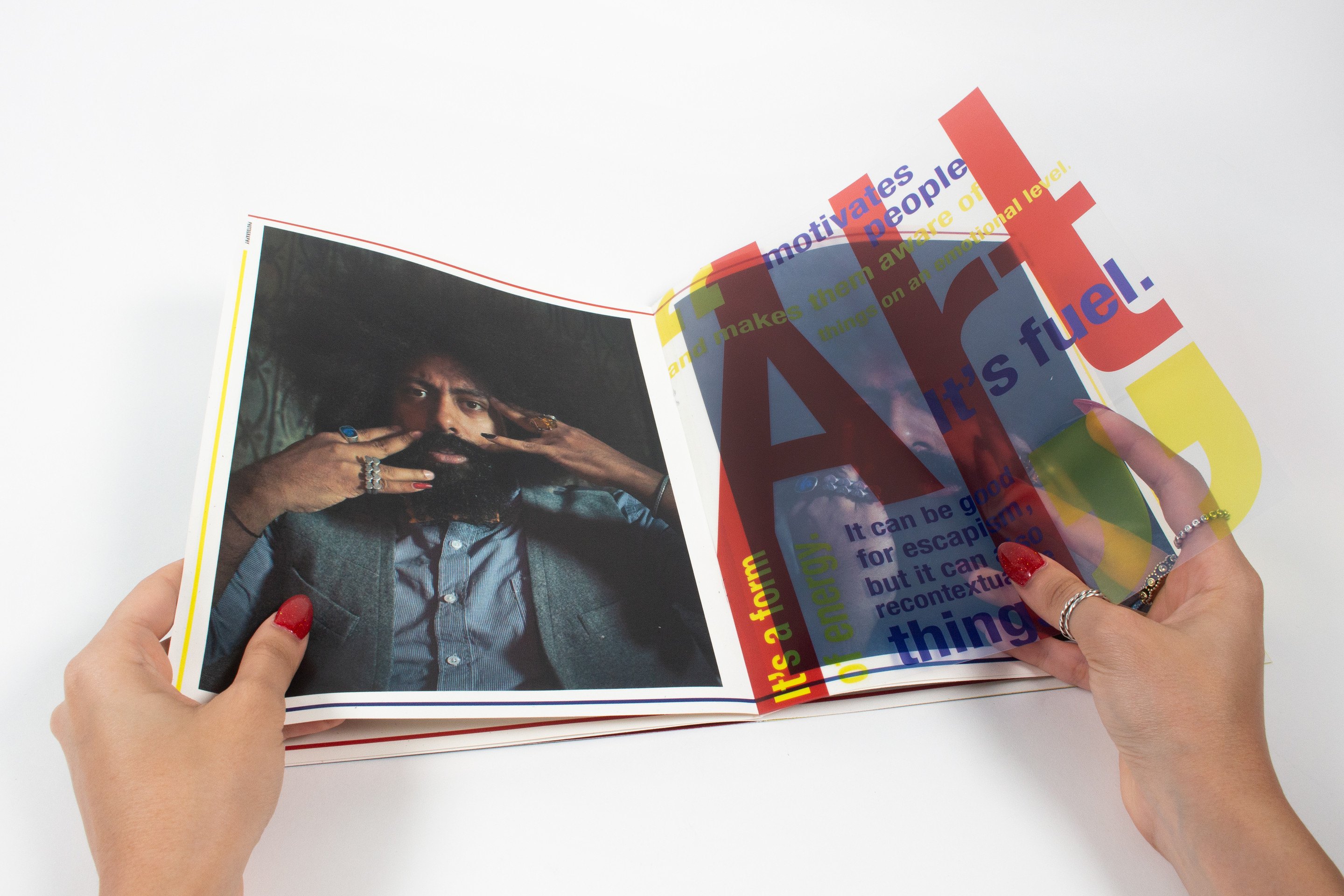
A hand turning the transparent sheet over the “Art” spread so the coloured type slides across the photograph beneath
Hands holding several transparent sheets fanned open at once above a spread, layers of red, blue and yellow type overlapping
A quieter spread, two columns of text beside a photograph of Watts on a fire escape, a small block of overlaid type at the fold
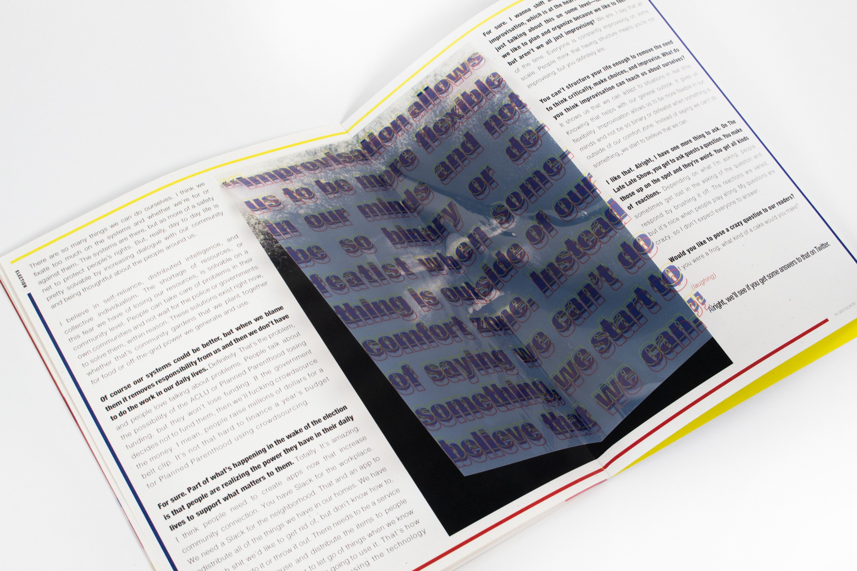
A spread photographed at an angle with a black page under the transparent sheet, so the overlaid type reads as white on black
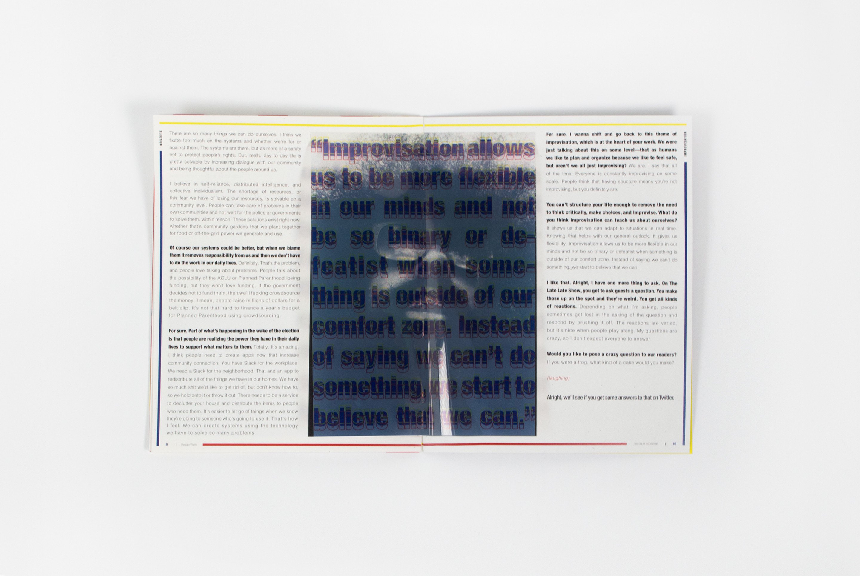
A pull-quote spread: “Improvisation allows you to be more flexible in our minds”, set very large across the left-hand page
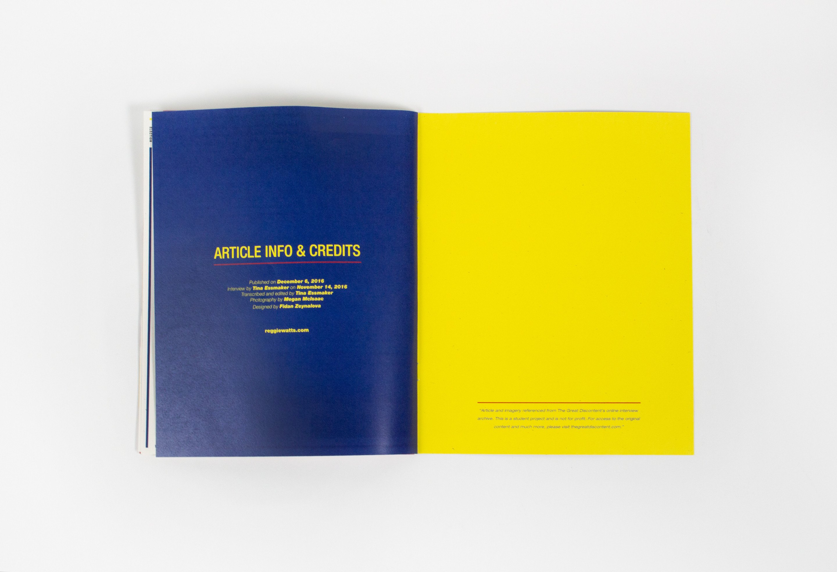
The closing spread: a flat blue page carrying the article info and credits facing a flat yellow page
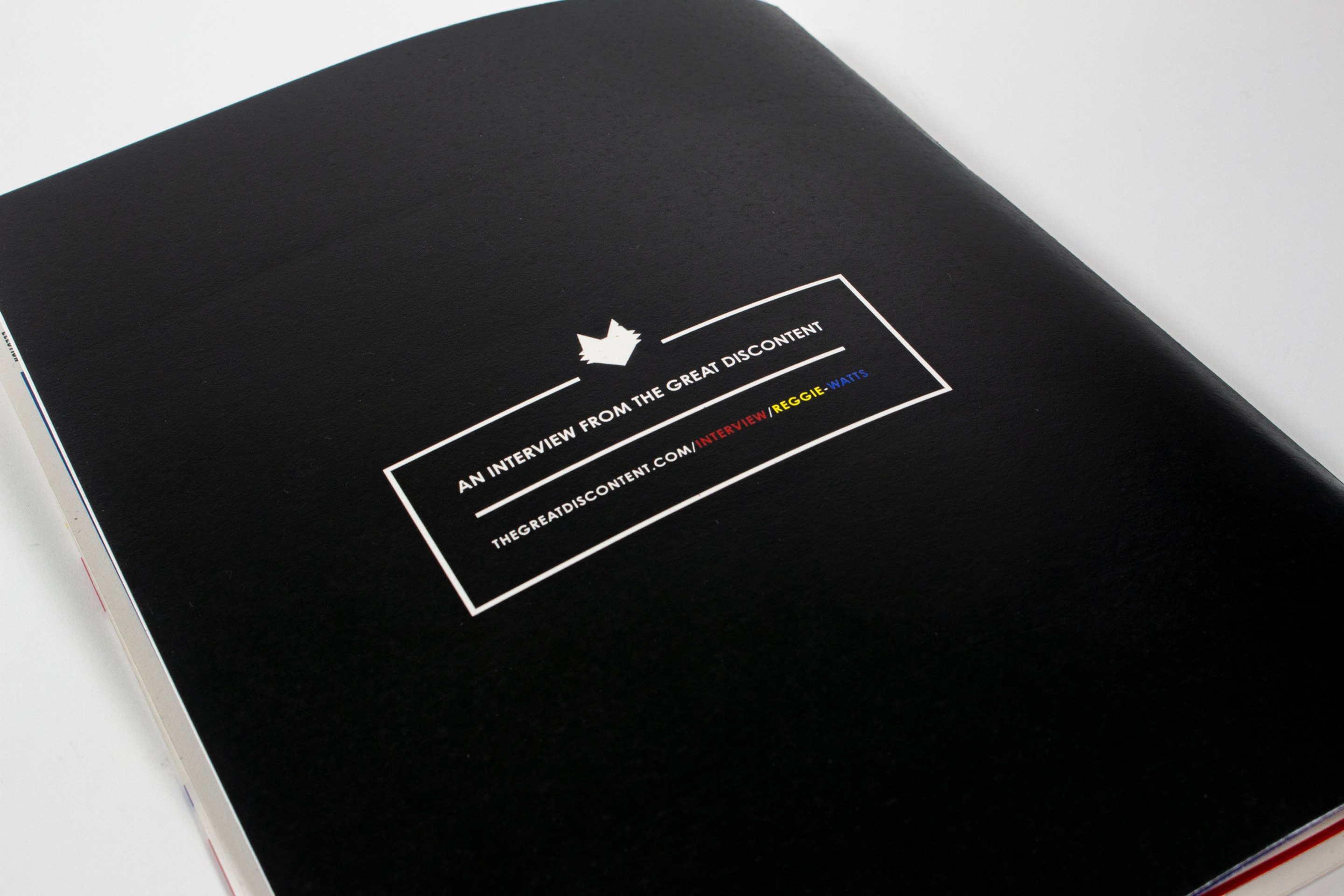
The back cover, black, with a small white-ruled box reading “an interview from The Great Discontent”

Magazine Design
Interview with Reggie Watts

This is a magazine of an interview with Reggie Watts, sourced from thegreatdiscontent.com and was made in a Typography II Studio course at the University of Florida. As a big fan of Reggie Watts, I decided to use his his interview in my magazine, where I was inspired by his funny and colorful personality. When I was designing the spreads, I decided to turn his quotes into a dynamic composition by creating typographical layouts on a transparent sheet and overlapping them in various ways. In general, this magazine turned out to be very interactive and full of character, which matches Watts personality in a creative way.

Fall 2017