
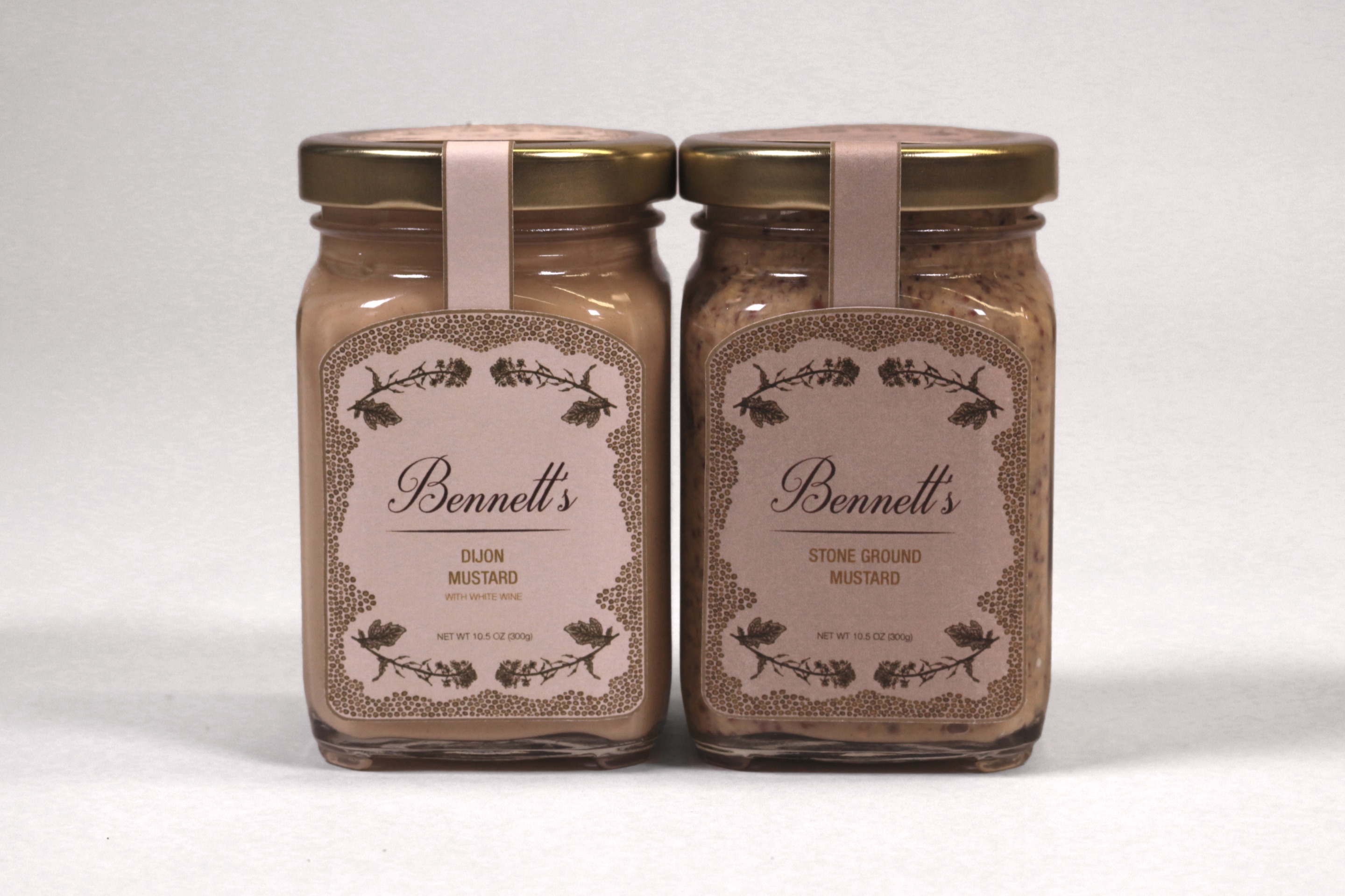
Two Bennett’s mustard jars, Dijon and stone ground, front labels facing the camera
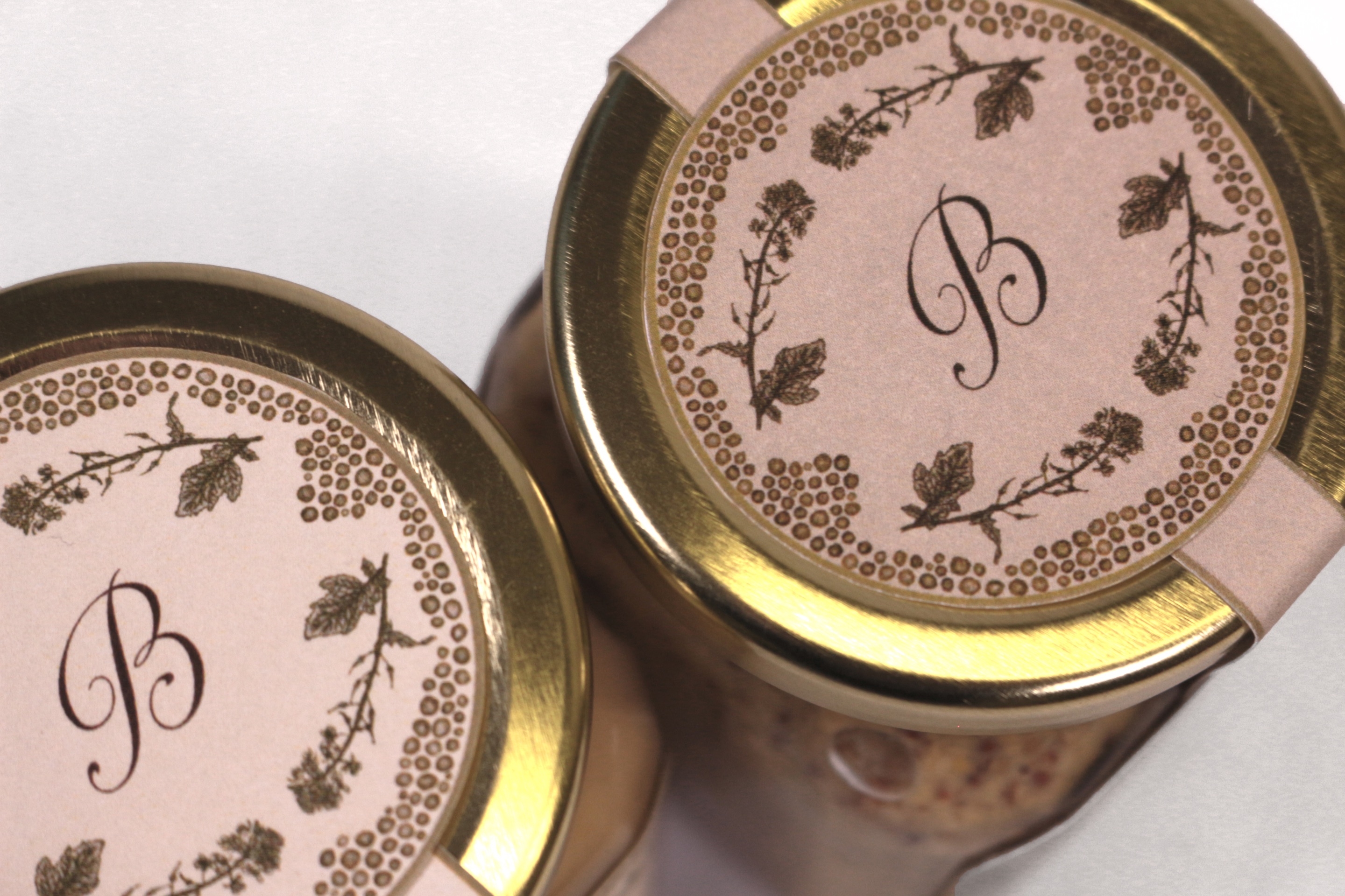
The jars from above, showing the monogrammed lids and the drawn mustard-flower border
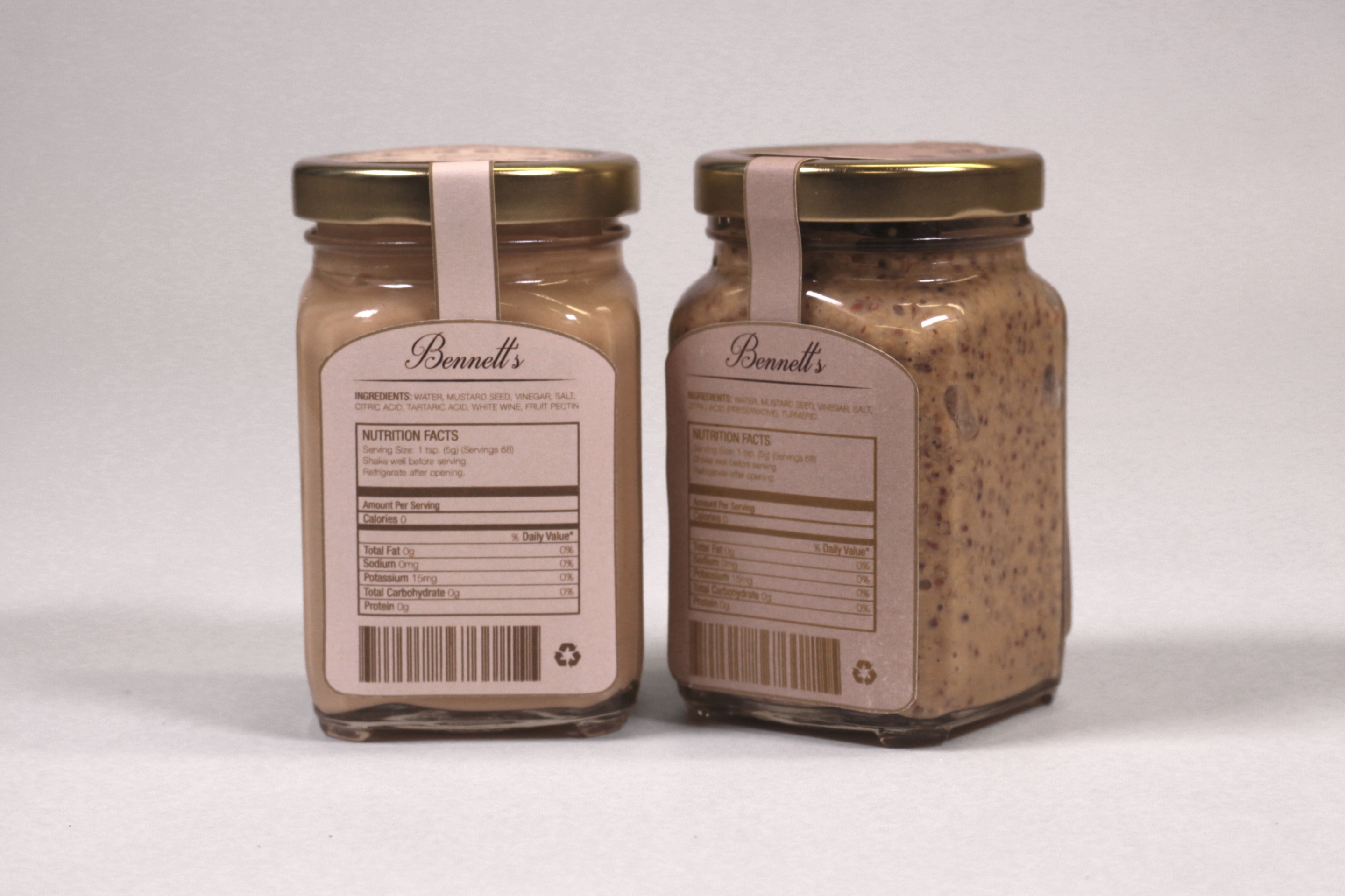
The backs of both jars, with the ingredients and nutrition panels set into the pattern

Mustard Jar Packaging

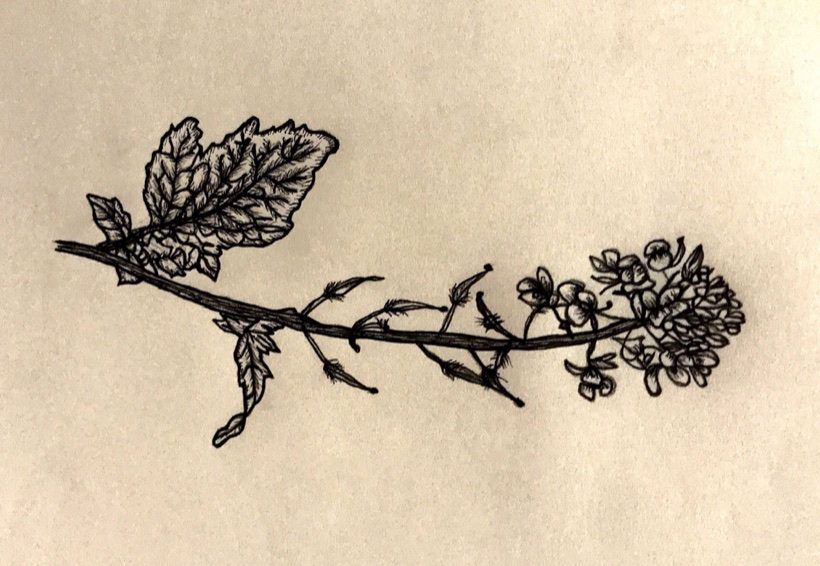
Packaging for mustard jars was made in Graphic Design Studio course at the University of Florida. This is one part of an assignment made for branding and packaging for the client named Francesca Bennett. I decided to illustrate a mustard flower and mustard seeds in order to incorporate them into a pattern that would shape the jar.

Flavours include: Dijon Mustard with White Wine and Stone Ground Mustard.

Fall 2017

Drawn Illustrations
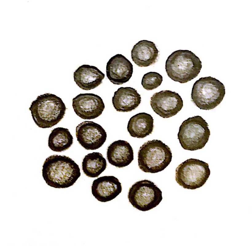
Drawn mustard seeds, a cluster of round seed heads in ink
A drawn mustard flower stem in ink, leaves and buds along its length

Bennett’s Tea

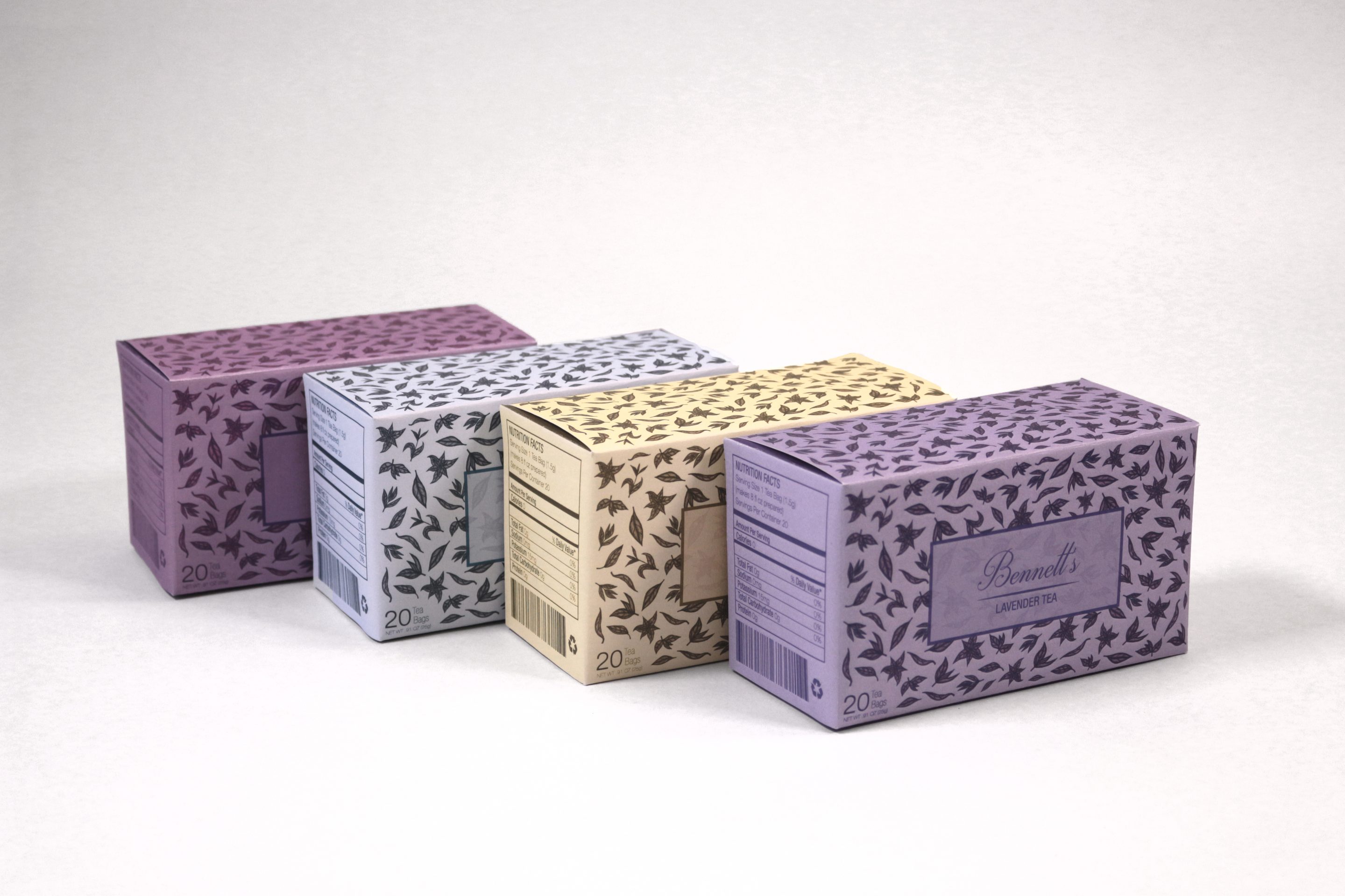
Four Bennett’s tea boxes in a row, each in its own colourway of the drawn leaf pattern, the front one lettered Bennett’s Lavender Tea
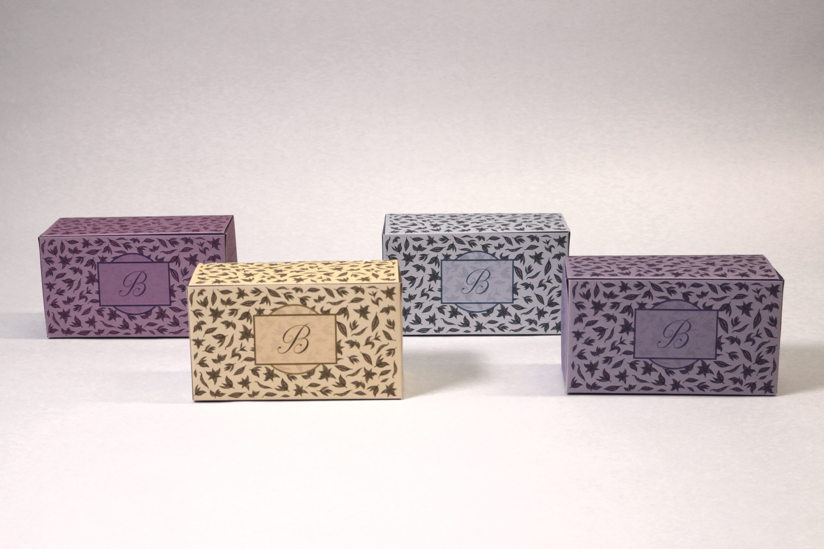
The same four boxes set apart on a pale ground, each turned to show the monogrammed B panel on its front
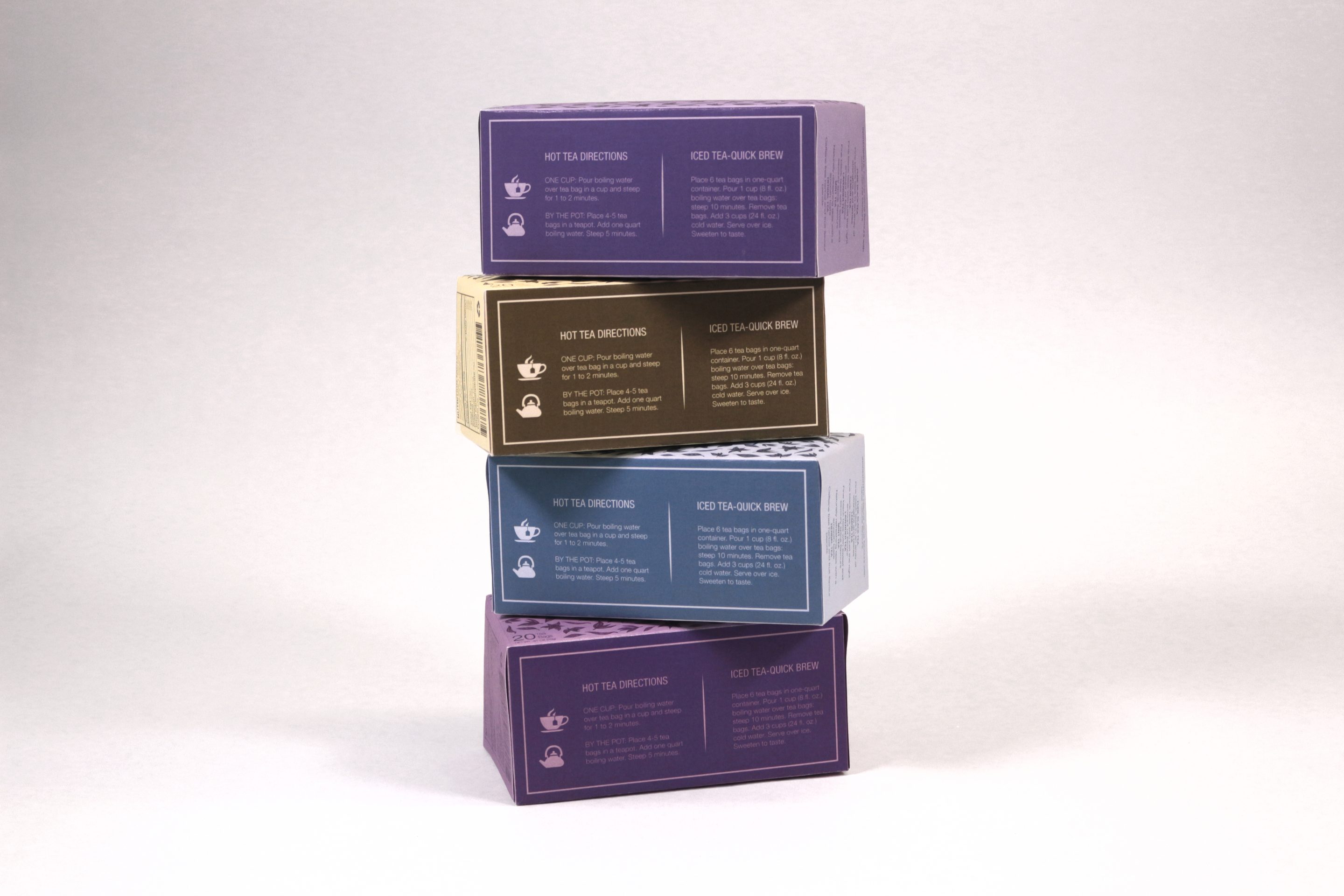
The four boxes stacked and staggered, back panels out, each carrying its hot tea directions and an iced tea quick brew beside them
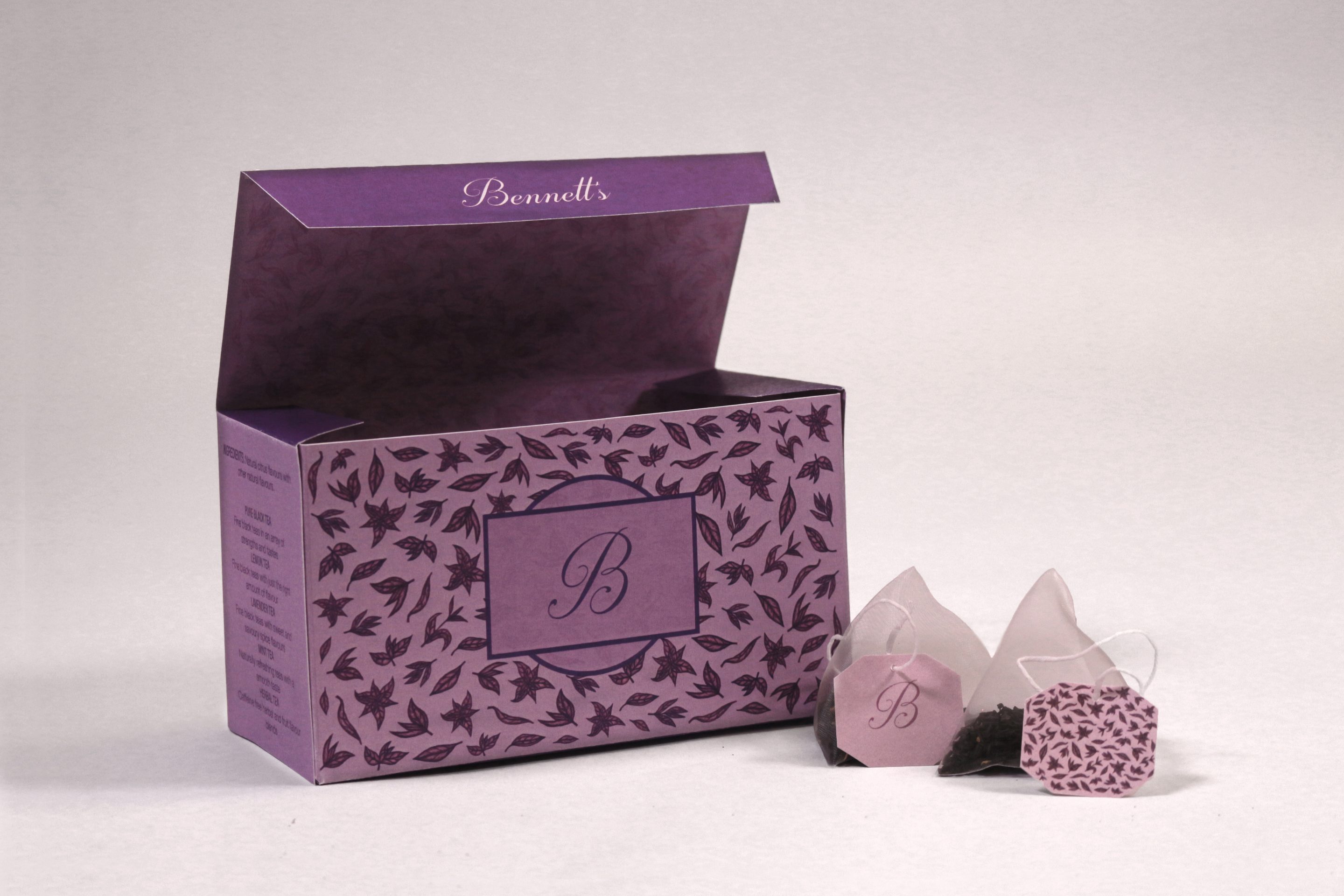
One box open in mauve, the lid folded back to show the printed lining, with three pyramid tea bags and their patterned tags beside it
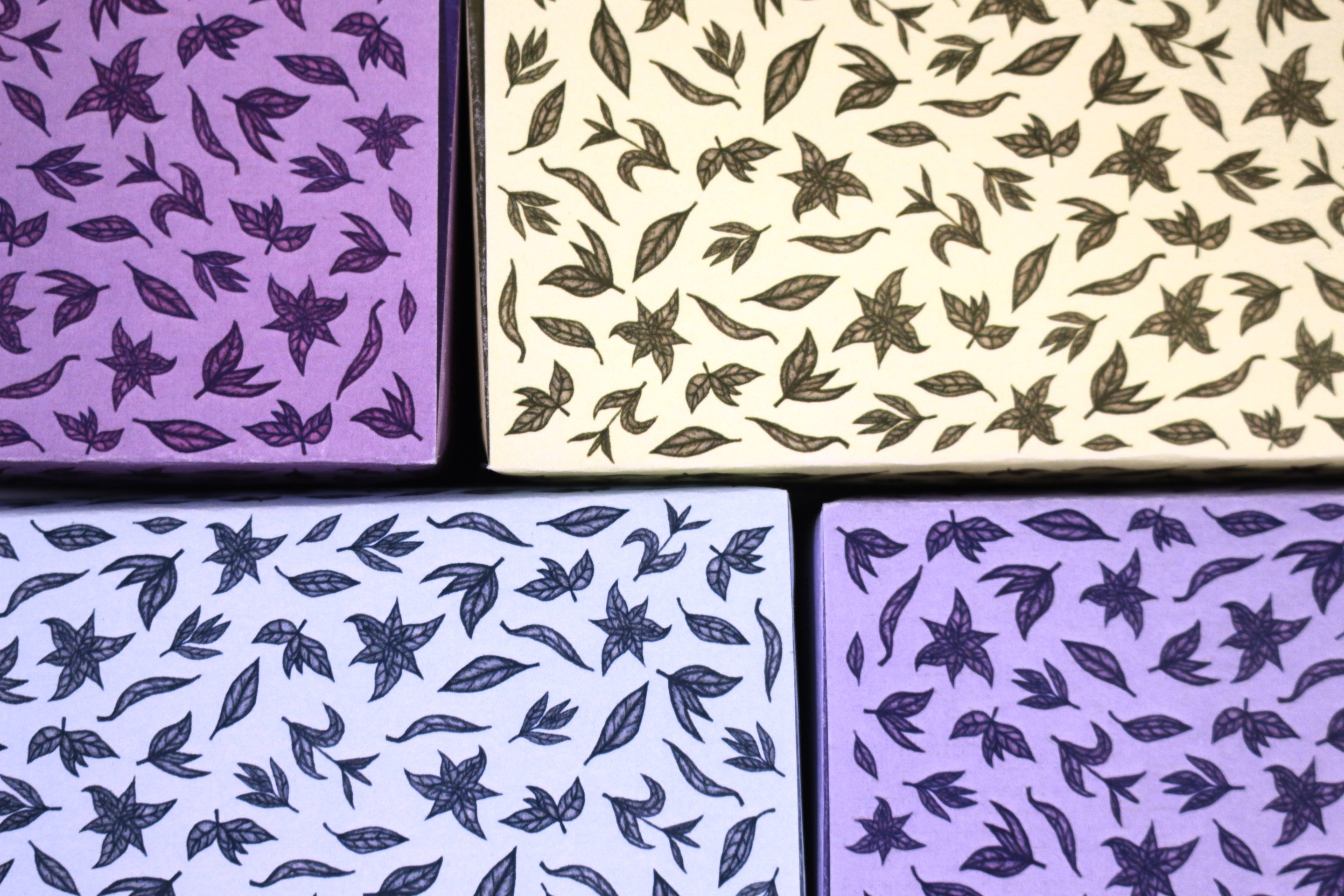
The four colourways as flat panels butted together: purple, cream, pale blue and lavender, each printed with the same drawn leaves and star-shaped flowers

This was an assignment in Graphic Design course at the University of Florida. The project included branding and package/web design for the Bennett’s company. I chose 4 different flavors of tea and created a pattern with the illustrations of tea leaves. Francesca Bennett as a client introduced her family business and asked for branding and designing some products including tea line and a mustard line. Therefore, I decided to use her family name as a company brand to expand her legacy furthermore.

Flavours include: Lavender, Lemon, Mint and Herbal.

Drawn Illustrations
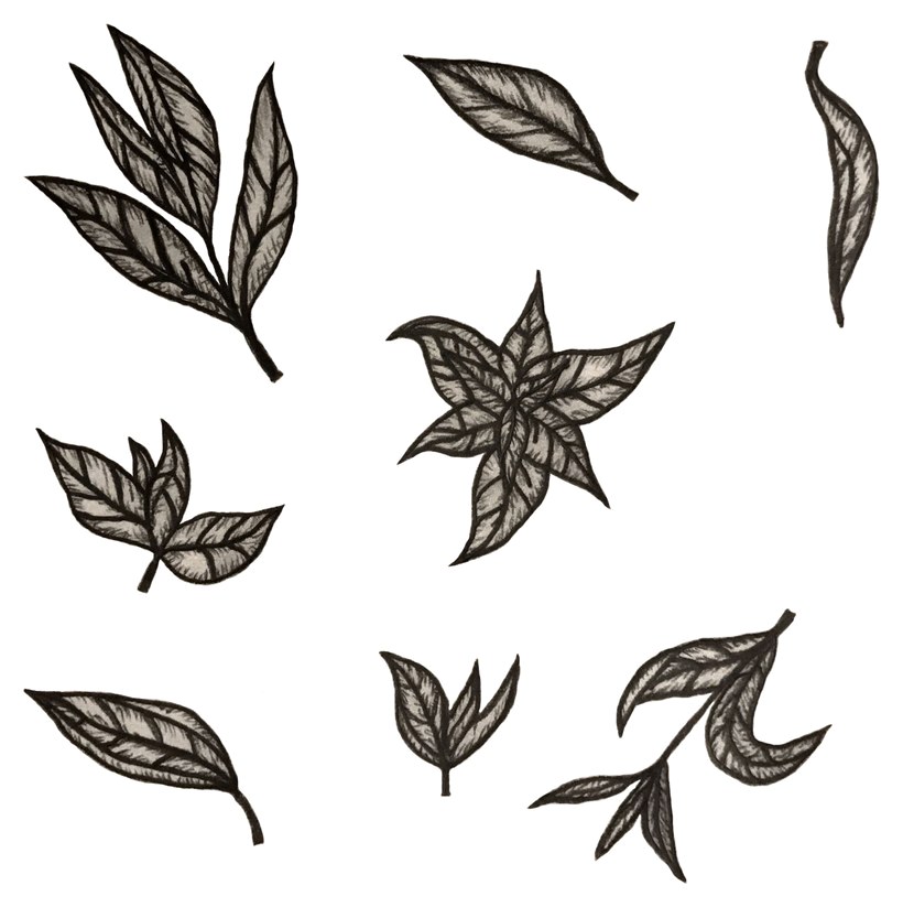
Drawn tea leaves in ink on white: single leaves, small sprigs and one star of six leaves, the nine motifs the box pattern is built from

Web Design

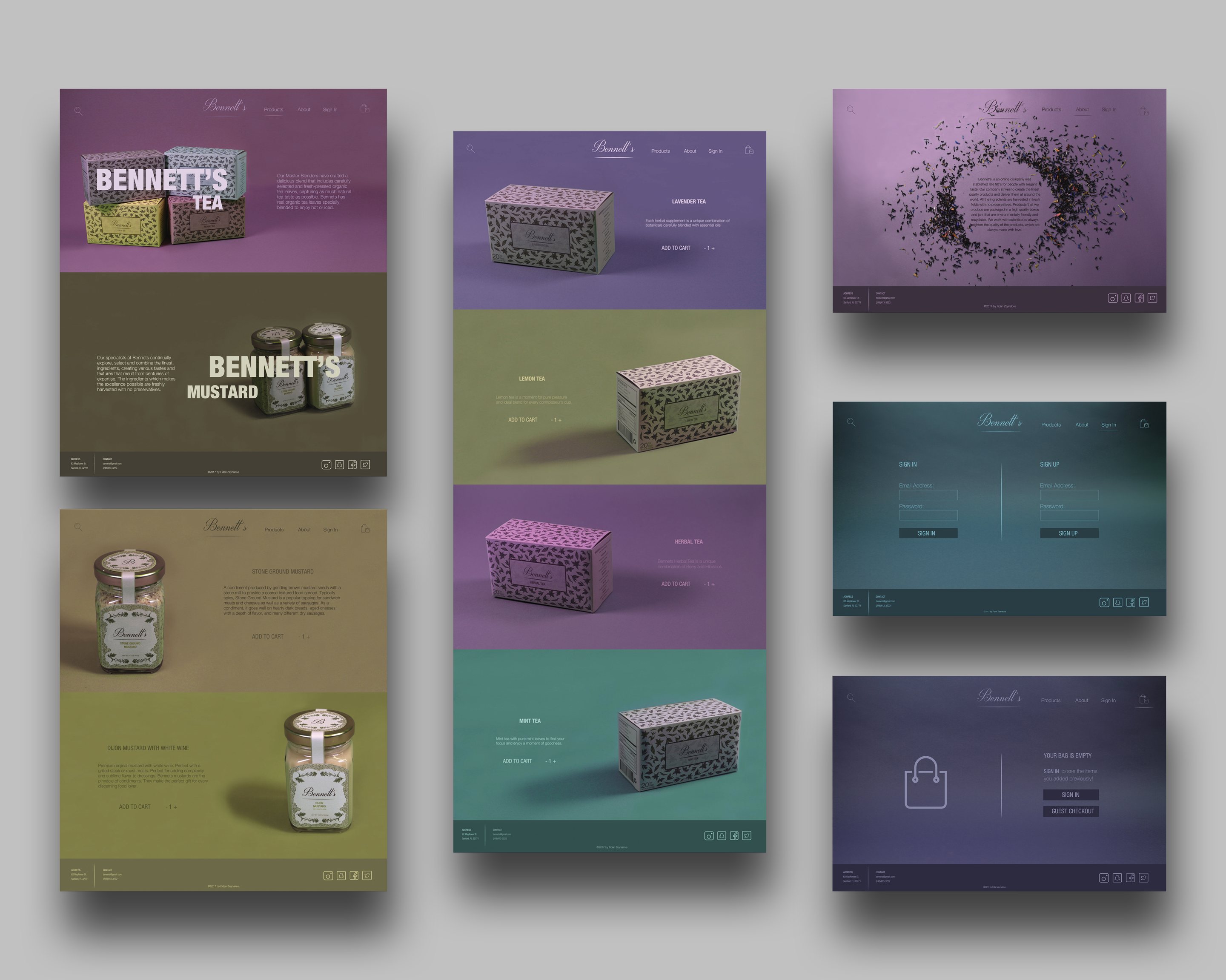
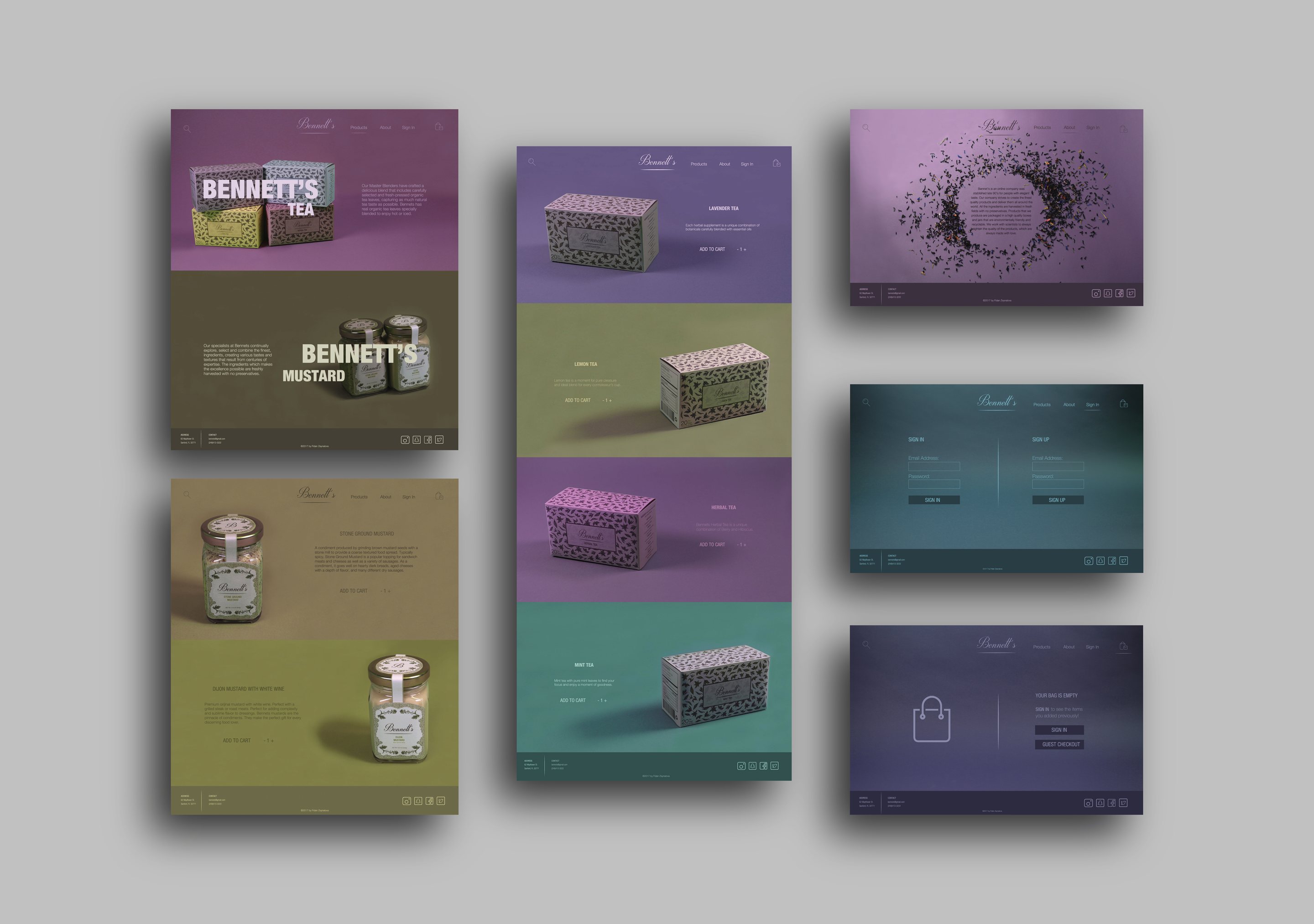
A presentation board of the Bennett’s website: a home page split between tea on plum and mustard on olive, a product page running lavender, lemon, herbal and mint as four full-width colour panels, a page of scattered tea leaves around a block of type, a sign-in screen and an empty bag screen
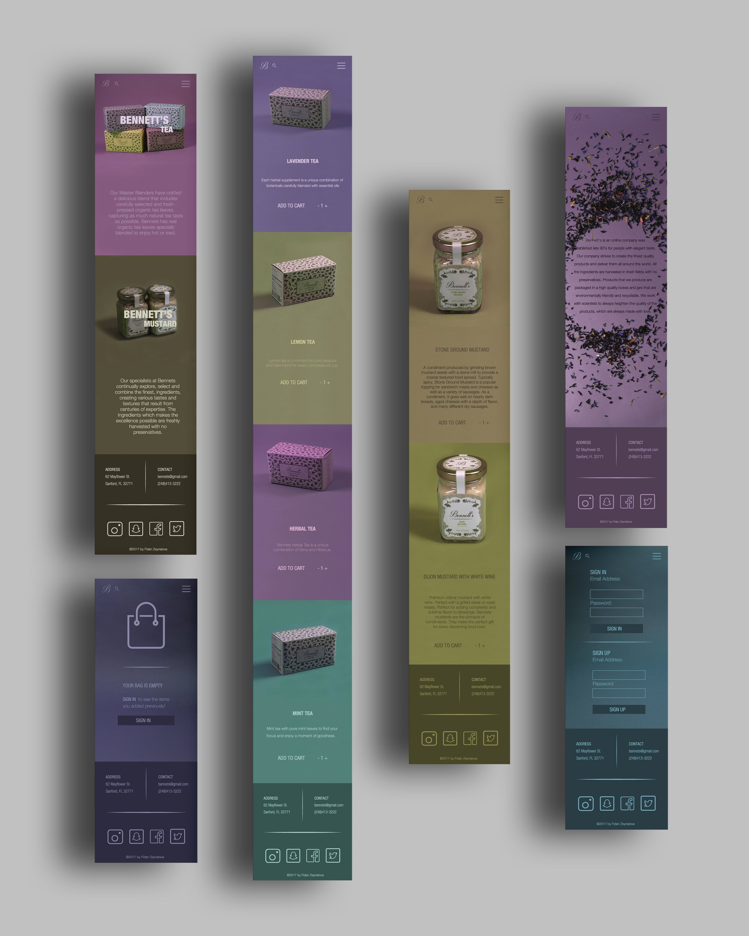
The same layout on a phone: six tall screens standing in a row, each flavour still holding its own colour top to bottom
The seven screens again, this time tilted in perspective and lit against a grey ground

The website was my first UX layout. Every flavour keeps its own colour across the whole screen, and the packaging was shot against a green screen so each box could be dropped onto its own ground, which is what lets one flavour run into the next as a single seamless transition rather than four separate pages.